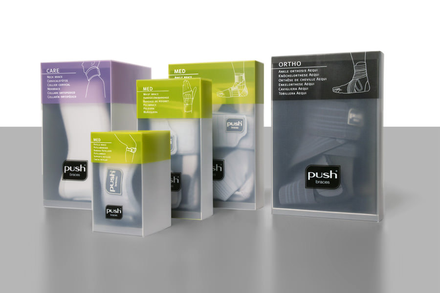
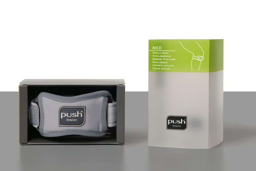
Remember the 90s? Think global, act local? As it turns out, thinking global, as in ‘the whole wide world’, is difficult. Thinking globally, as in ‘broadly’ or ‘roundly’, is an easier task. Still challenging, but easier. What’s required is finesse. And emotion (never linear, always round). NEA International is a compact company with big ideas, lots of emotion and a great deal of finesse. They asked WAACS to develop a new look & feel for their brand of PUSH medical braces: 18 products in three categories: CARE, MED, ORTHO. Aimed at the international market, the PUSH medical braces –
known for their orthopedic excellence – needed to be communicative (addressing individuals as well as professionals), instructive (which grade is best for which complaint), easy to identify and distinguish (cross-culturally), and, well, stylish (fashion, after all, is feeling). Working closely with R&D, WAACS developed the colour coding for and within each category, identified the materials, and created the necessary technical drawings to ensure production precision.
