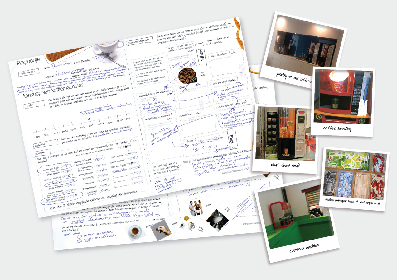
Coffee machines for offices and workplaces tend to scream coffee, showing coffee images, coffee beans, using coffee words and coffee colours, and depicting coffee loving people enjoying their coffee together. Well, that’s a lot of coffee. While there’s more to say about hot beverages at the workplace. What to think of people who prefer tea? Not to mention the deeper meaning of a coffee machine, being the hangout for literally everyone, about five to eight times a day. Then why only talk about coffee and the coffee brand? Maybe the machine could be the best ever bulletin board or wallpaper in the office, as we investigated in this trial.
How we broke it
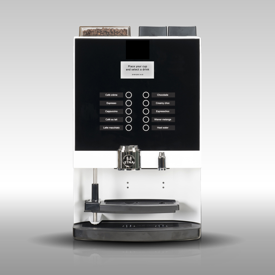
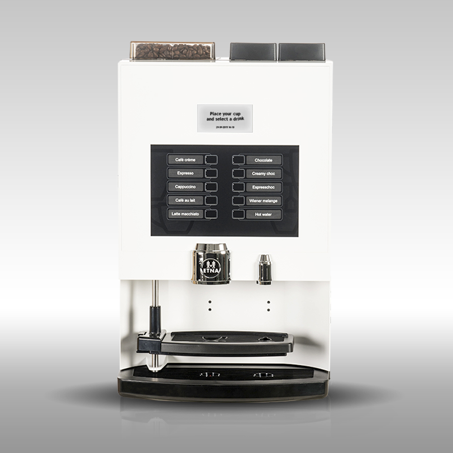
For ETNA we talked a lot with the facility managers who maintain hot beverage machines and who decide on the purchasing. That meant a shift of focus to: easier management (no hassle), better fit in the environment, and a more neutral design with possibilities for own design and identity. The functions of the machine were made clear without further explanation. We managed to design a range of new interfaces using a clear UI instead of the usual fuzzy menus.
Why we did it
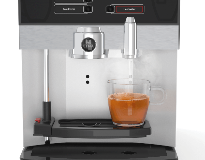
And we became friends with tea lovers. What they really don’t like is the idea of having tea out of a coffee machine. In that area, we made big steps in the output area of the new machines. There is a clear separate tap for hot water. Clean, light and clear. A breakthrough compared to an indeterminate dark cave where machines were brewing ‘some dark drink’ for you. The entire machine is clearly divided into a branding area, an interface area and a serving area.
The WAACS story
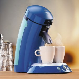
At WAACS we worked a lot on coffee machines, since we designed the Senseo together with Sara Lee/DE (now Master Blenders) for Philips. We believe big steps are rarely made on brewing technique; the challenge is a better understanding of people who are using the machines. Or in this case: the people who decide on the purchase and keep them running.
For tea lovers there is a clear separate tap for hot water. Clean, light and clear.
