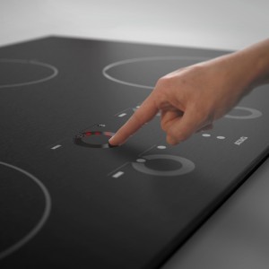
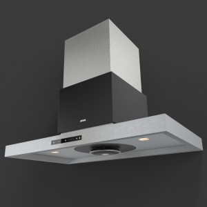
Every microwave has a door, a handle and a control area. The design is dictated by the structure behind it. UX and aesthetics follow that structure. As a result: they all look the same. An expensive microwave means the same layout but just with more metal. Beneath all the metal the functions are the same.
How we broke it
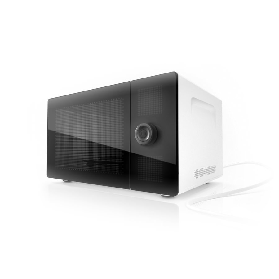
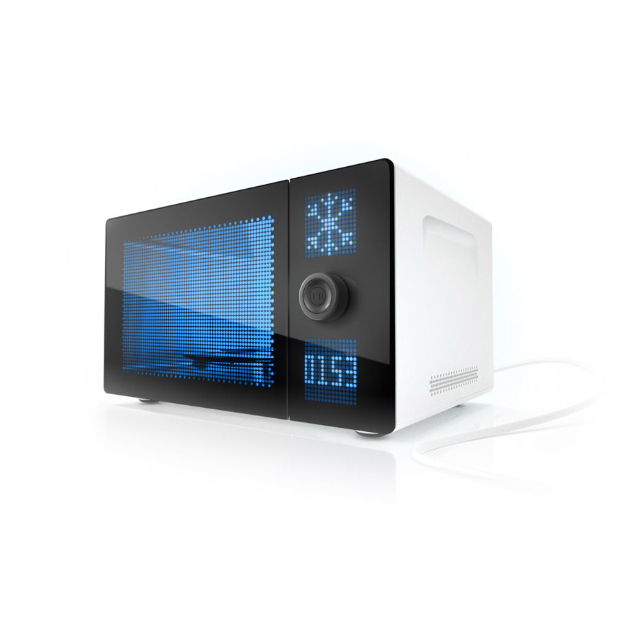
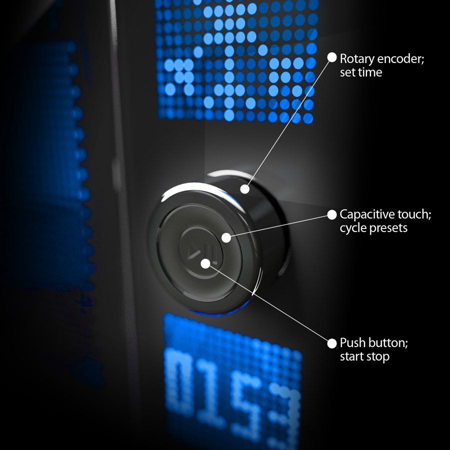
We have simplified the control area. The whole front is a glass facade. We did it with one thing in mind: a microwave heats, an that’s it. So you only have to choose power and time. That can be done with one knob. And while reducing to the essence we even looked at the 2 million pixel LCD’s. A simple dot matrix looks better.
Why we did it
We design microwaves. We know what defines them and what the limits and possibilities are. With this model we found out what happens when we leave behind us the limitations and when UX and aesthetics become leading, instead of the components behind them. In other words, we illustrate WAACS rules #27.
The WAACS story
WAACS is working on microwaves for several clients. It’s not easy to make the big steps in existing ranges. But that doesn’t stop us from big thinking and from making smaller but fundamental changes.

RELATED PROJECTS

